I found this new technique in the latest issue of the Do Crafts magazine and I have been meaning to try it for a few weeks. Being as it makes use of my favourite product - clear embossing powder, I couldn't ignore it for long.
Here is a version of the card that was shown in the magazine so you get an idea of what I am talking about:
The technique involves stamping with Versamark clear ink onto coloured card. Make sure this is the colour that you want to show through the paint. Then emboss the image with clear embossing powder.
Then, paint over the whole image with your chosen acrylic paint and leave to dry. When it's completely dry, use a damp cloth (I actually used a face wipe but I think this might have been a bit too wet) to wipe over the stamped image to lift the paint off the embossing to reveal the colour of the underneath card. Then leave it to dry. You might also need to flatten the paper as well as it's prone to curling after heating and painting. Putting it under a heavy book or box will do the trick.
Here is a close up of the card:
On the flowers, once they had dried, I added a bit of turquoise ink to make it slightly darker. I painted on the gold elements in the background and on the flowers centres with sunshine sparkle perfect pearls powder. I then added some jewels.
I then tried a variation on a theme:
For the main image I used red card and the metallic bronze paint. For the background, I used black card and then covered it which Tim Holtz picket fence distress stain as I didn't have any white paint. This didn't work quite as well as the paint, but it did still work. I had to apply quite a bit to get the white you can see in the picture and I rubbed it away before it had dried. Once the background had dried I inked the edges with victorian velvet distress ink and left to dry.
The ribbon was secured to the back of the card and then twisted and fastened on the other side. Two lengths of the same ribbon were tied into a bow and secured to the front using glue dots. Some grey pearls where added to the corners of the main image:
I love this new technique and although the cards aren't perfect, there is plenty of room for experimenting and perfecting the technique. It is a little bit messy and time consuming as you have to wait for each piece to dry, but the effect it creates is certainly worth the wait.
Showing posts with label perfect pearls. Show all posts
Sunday, 25 March 2012
Friday, 29 July 2011
Friday's card project - using sketches
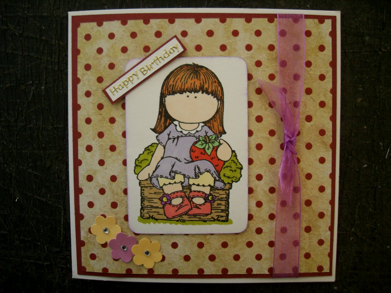
I was looking through some blogs this morning for some inspiration and came across a sketch that I wanted to try out. I can't make it come up on here, but it was for a square card with an image on the left, some ribbon on the right and then some decoration. I didn't copy it exactly but made my own version of it as this card demonstrates:
The image was coloured with pro markers and some card candi was added to the top left of the picture.
For the next card, I changed a few things around but the general layout is the same:
I added some flowers to the bottom left corner instead of the card candi and the sentiment was added as an extra piece going at an angle on the top left of the picture. Instead of mounting the picture onto some coloured card I very gently inked the edges. I didn't want much colour around the picture so I inked it from behind which left a very small line of ink on the front, just enough to give it a little bit of colour.
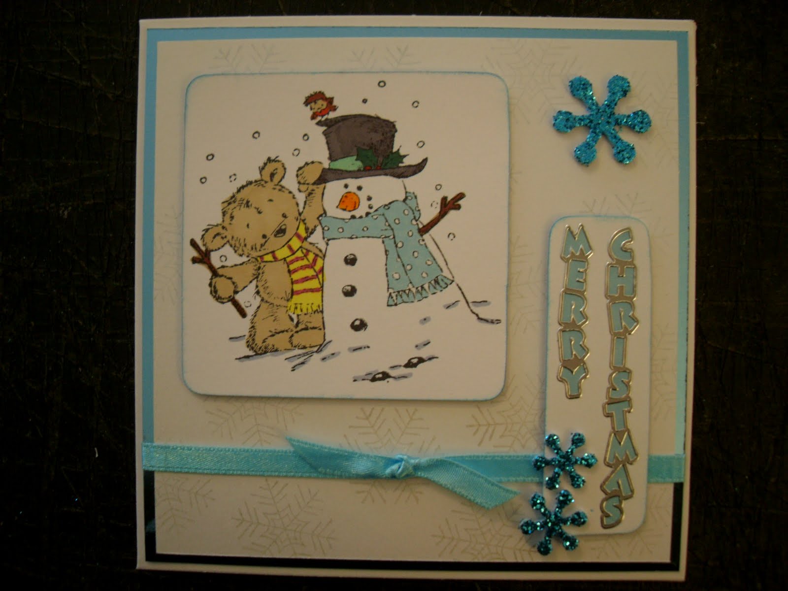
Then I decided to turn the design around 90 degrees for the next card and had the ribbon on the bottom instead of the right hand side.
I put the picture on the left instead of in the centre and the sentiment is going down. The blue snow flakes replace the flowers on the last card. I also inked the edges of both the image and the sentiment topper to define it from the background. Although it doesn't come up very well in the picture, the background has very faint blue snowflakes on it which I created using perfect pearls powder dusted over an image stamped with clear ink. They are pearlescent so they shine when they get into the right light and look very good on a contemporary Christmas card such as this one.
Sketches can be very good ways of providing inspiration when you are tired of using the same layouts in your cards. Sometimes they can also prove quite challenging as well and it's always fun to try out new things - why don't you have a go!
Claire
The image was coloured with pro markers and some card candi was added to the top left of the picture.
For the next card, I changed a few things around but the general layout is the same:
I added some flowers to the bottom left corner instead of the card candi and the sentiment was added as an extra piece going at an angle on the top left of the picture. Instead of mounting the picture onto some coloured card I very gently inked the edges. I didn't want much colour around the picture so I inked it from behind which left a very small line of ink on the front, just enough to give it a little bit of colour.
Then I decided to turn the design around 90 degrees for the next card and had the ribbon on the bottom instead of the right hand side.
I put the picture on the left instead of in the centre and the sentiment is going down. The blue snow flakes replace the flowers on the last card. I also inked the edges of both the image and the sentiment topper to define it from the background. Although it doesn't come up very well in the picture, the background has very faint blue snowflakes on it which I created using perfect pearls powder dusted over an image stamped with clear ink. They are pearlescent so they shine when they get into the right light and look very good on a contemporary Christmas card such as this one.
Sketches can be very good ways of providing inspiration when you are tired of using the same layouts in your cards. Sometimes they can also prove quite challenging as well and it's always fun to try out new things - why don't you have a go!
Claire
Subscribe to:
Posts (Atom)