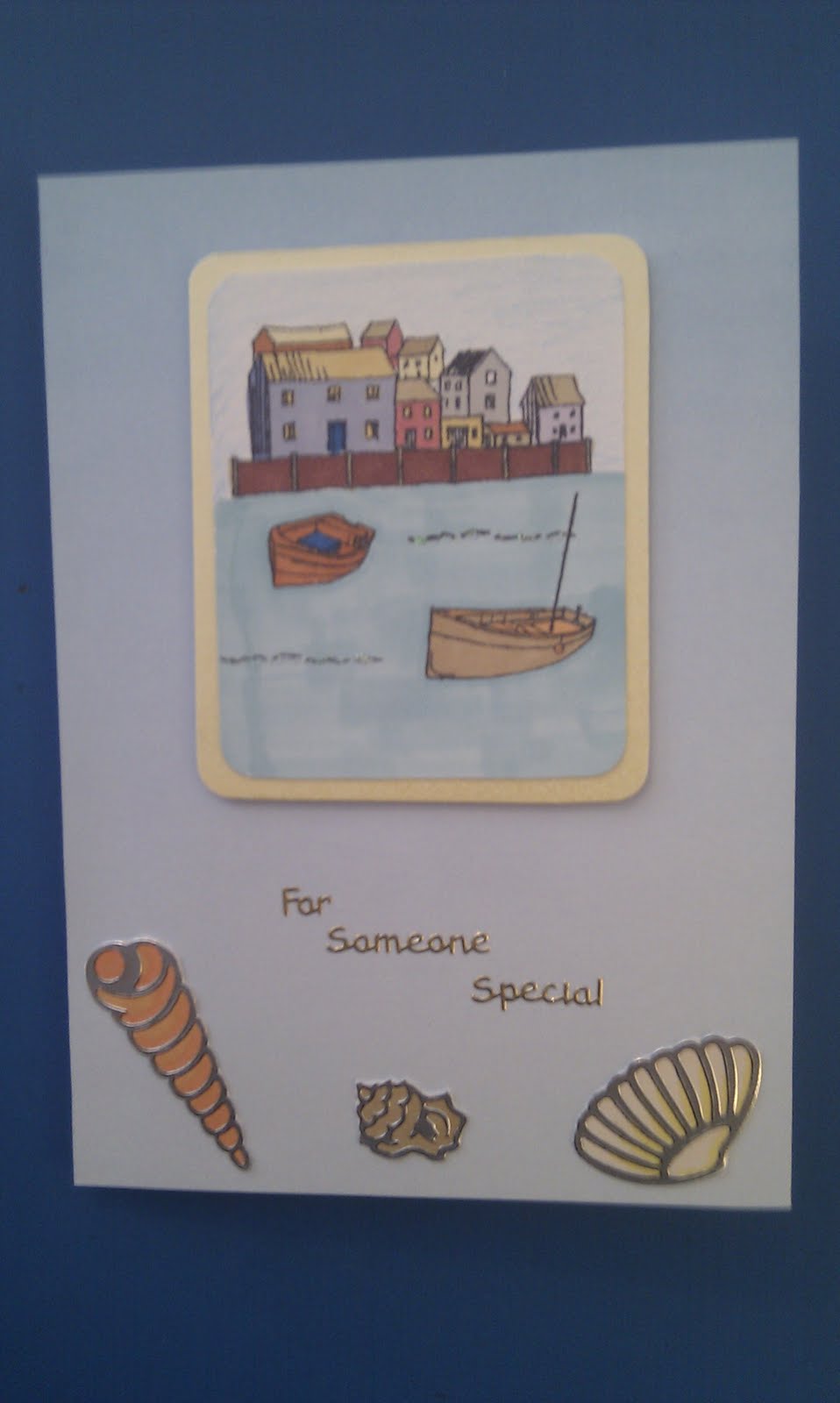
I love learning new techniques when it comes to card making and all things paper crafts and when I look back at the cards I first made, I can certainly see how much I have learnt.
At the moment I like making as much of the card as I can without the help of pre-printed papers, peel-offs etc. I bought some stamps before Christmas and didn't have much time to try them out but in the last few days I have been experimenting, with some rather good results I think.
Here is the one card I made with the stamps back in November and everything is created by me:
For the background I stamped the words stamp onto some pink card several times. I then inked up the flowers stamp and took the ink off with my brayer. I then brayered the image over the words in a purple ink. The picture at the forefront was stamped and embossed with clear powder and then cut out. The same was done with the butterflies - first onto pink card with pink ink and then the larger butterfly was embossed with purple ink, cut out and stuck onto the first image. I bent the wings to give a 3D effect and added some pearls. This is my most favourite card so far.
Then I tried my other set of stamps and here is the result:
For this card I stamped the image onto plain white vellum and dried it with a heat gun. I then coloured it on the back with pro markers and heated it to dry again. I then had to flatten it under a book as it had bent slightly. It was mounted onto a scallop square which had been inked with a bronze ink, and secured with red brads. The sentiment and small bird were also heat embossed with bronze metallic powder. The backing paper (which unfortunately I didn't make in this one) was mounted onto core'dinations card and sanded over, which gave the white edge to the paper. Then the ribbon was added.
The other technique that I absolutely love at the moment it painting onto black card. I received some vintage paints for Christmas which I tried out on these cards:
For the main images on both I heat embossed them onto black with black glint embossing powder. I then coloured in the images with the vintage paint. The corners on each card were black peel off's which I stuck to black card and painted in co-ordinating colours. A different take on the monochrome look I think.
And following on the same theme is the last card:
I had already made several calendars using the butterfly stamp but this time, instead of using a white embossing powder, I used the pearlescent green one. Again it was coloured in with the vintage paints and mounted onto mint green pearlescent card. The swirls behind the butterfly have been embossed with the same green pearl powder but because they are on white, the effect is much more subtle. The sentiment was embossed in the same powder and used to prop up the easel card.
Now, back to the craft table as I have lots more ideas in mind to try - watch this space!
Showing posts with label core'dinations card stock. Show all posts
Monday, 2 January 2012
Friday, 5 August 2011
Another attempt at a scrapbook page
When looking through some old pictures I came across a really nice one that had been taken at a hotel I used to work at. After studying it for a while I decided on the colours I was going to use and attempted to make up another scrapbook page. I am still new at this and the pages I make are no where near as nice as the ones I have seen in magazines, but it's a start.
Here is the finished page:
The first idea I had was to make something of the blue lights that were in the cigar shack so I matched them with the blue mirri card. I made the lace type border by punching out inverted scallops using a scallop circle punch. I took the off cuts and placed them under the picture to give a scallop type edge.
The cushions in the cigar shack were a red and brown colour so I chose this core'dinations card and scored some lines in a grid pattern onto them. I then sanded them to reveal the core colour and rounded the edges. They reflect the cushions in the shack quite well.
The newspaper cutting was cut out and the edges distressed with an ink pad and a sponge. There is also a slight gold colour that has been sponged onto the cutting too.
For the title I adapted my technique of sticking things on and inking over the top. I had some sticky letters which I de-tacked by sticking them to my clothes a few times so they wouldn't rip the paper when I tore them off. When they were stuck into place I inked over them with the same ink used for the newspaper cutting. I then took each letter off and it left a brilliant outline.
The tags were added for the journaling piece and the brown tag has been outlined and dotted with some platinum liquid pearls. I added the piece of ribbon in the corner and secured it with a brad but I am not sure about it - it seems a bit too random for me!
Anyway, I hope you like it and I'm sure I will find some more pictures to scrapbook soon.
Claire
Here is the finished page:
The first idea I had was to make something of the blue lights that were in the cigar shack so I matched them with the blue mirri card. I made the lace type border by punching out inverted scallops using a scallop circle punch. I took the off cuts and placed them under the picture to give a scallop type edge.
The cushions in the cigar shack were a red and brown colour so I chose this core'dinations card and scored some lines in a grid pattern onto them. I then sanded them to reveal the core colour and rounded the edges. They reflect the cushions in the shack quite well.
The newspaper cutting was cut out and the edges distressed with an ink pad and a sponge. There is also a slight gold colour that has been sponged onto the cutting too.
For the title I adapted my technique of sticking things on and inking over the top. I had some sticky letters which I de-tacked by sticking them to my clothes a few times so they wouldn't rip the paper when I tore them off. When they were stuck into place I inked over them with the same ink used for the newspaper cutting. I then took each letter off and it left a brilliant outline.
The tags were added for the journaling piece and the brown tag has been outlined and dotted with some platinum liquid pearls. I added the piece of ribbon in the corner and secured it with a brad but I am not sure about it - it seems a bit too random for me!
Anyway, I hope you like it and I'm sure I will find some more pictures to scrapbook soon.
Claire
Thursday, 4 August 2011
Cards made with Scenes
I bought these scene stamps from a fair I went to in July and have been getting around to using them. The set is by Hobby Arts and comprises of a sheet with lots of different images on. The idea is that you can build up these images to create your own scene. I tried looking online to find some inspiration on where to start but I couldn't find any pictures, which is why I have been a bit slow to use them. However, I thought I would try today.
The first one I made was this one. This was made using one picture that I did find online which gave me a starting point:
I had to do a bit of masking when it came to leaning the surf board against the wall. I had done this once before but I did have to practice again before doing it on this card. I found it was actually quite easy but you have to do it back to front and stamp the image that will be in the front first. I really love the small people on this card.
The next card was an experiment and I think it turned out quite well for a first attempt on my own:
It only used a few of the stamps on the set but I really like the stamp that has the ripple effect. I added some glitter to these ripples to make them shimmer.
Then I thought I would play it safe and use the camper van stamp to create a male card (or female - it can be for either!).
I stamped the van four times and coloured each one a different colour to reflect the many different camper vans that are around. I mounted each one onto black card stuck them onto a stripy backing paper that was mounted onto a light blue card. The card gives a fresh summery feel.
The next card is an example of when mistakes are made and how they can be rectified. I started stamping a scene but then decided I wanted to add more to it. Here is where it went a bit wrong and the join in the cliffs is quite obvious.
I had already stamped and coloured the image and I didn't want to do it again so I covered it up with a sentiment topper:
I'm not too sure about it - the picture doesn't seem quite in proportion and I am not sure about the sentiment in the centre of the picture, but I will leave it and see if it grows on me. I mounted the image onto yellow core'dinations card and lightly sanded the edge of it which made the picture stand out even more.
I hope you like them - some summery cards to brighten you days.
Claire
The first one I made was this one. This was made using one picture that I did find online which gave me a starting point:
I had to do a bit of masking when it came to leaning the surf board against the wall. I had done this once before but I did have to practice again before doing it on this card. I found it was actually quite easy but you have to do it back to front and stamp the image that will be in the front first. I really love the small people on this card.
The next card was an experiment and I think it turned out quite well for a first attempt on my own:
It only used a few of the stamps on the set but I really like the stamp that has the ripple effect. I added some glitter to these ripples to make them shimmer.
Then I thought I would play it safe and use the camper van stamp to create a male card (or female - it can be for either!).
I stamped the van four times and coloured each one a different colour to reflect the many different camper vans that are around. I mounted each one onto black card stuck them onto a stripy backing paper that was mounted onto a light blue card. The card gives a fresh summery feel.
The next card is an example of when mistakes are made and how they can be rectified. I started stamping a scene but then decided I wanted to add more to it. Here is where it went a bit wrong and the join in the cliffs is quite obvious.
I had already stamped and coloured the image and I didn't want to do it again so I covered it up with a sentiment topper:
I'm not too sure about it - the picture doesn't seem quite in proportion and I am not sure about the sentiment in the centre of the picture, but I will leave it and see if it grows on me. I mounted the image onto yellow core'dinations card and lightly sanded the edge of it which made the picture stand out even more.
I hope you like them - some summery cards to brighten you days.
Claire
Tuesday, 19 July 2011
July's handmade cards
I feel like I haven't made many cards recently, but then I look at the pictures I have taken of them all and realise that there are actually quite a lot. I had run out of inspiration for anniversary and wedding cards, which seemed to be the most popular and most requested so when I got some new products through I was very pleased to feel inspired again:
I have also been playing around with the new stamps I got and although I have made a few with them already there were still more cards I could make out of them including this one with the camper vans on it - perfect for both male and female I think:
These cards were made with my new peel off's
These gorgeous little girl stamps were borrowed from a friend.
And this new stamp was used to make a boy's card, which I never get any inspiration for at all!
My obsession with core'dinations cardstock continues and after my attempt at scrapbooking (which I will post pictures of later) I tried some more cards, both with the distressed look and the more sophisticated, neat look to them:
And here are the rest:
My favourite one is the gingerbread people on the engagement card!
Claire
I have also been playing around with the new stamps I got and although I have made a few with them already there were still more cards I could make out of them including this one with the camper vans on it - perfect for both male and female I think:
These cards were made with my new peel off's
These gorgeous little girl stamps were borrowed from a friend.
And this new stamp was used to make a boy's card, which I never get any inspiration for at all!
My obsession with core'dinations cardstock continues and after my attempt at scrapbooking (which I will post pictures of later) I tried some more cards, both with the distressed look and the more sophisticated, neat look to them:
And here are the rest:
My favourite one is the gingerbread people on the engagement card!
Claire
Subscribe to:
Posts (Atom)